By Kim Babberl
The amount of data produced daily has grown exponentially with nearly 90% of the world’s data generated in the last two years alone. To ensure we can make sense of this data, analysts must find meaningful ways to present the information to their audiences. They must do it quickly and concisely, all while making it seem effortless. And, it definitely is not.
Data visualization is a powerful healthcare tool because it can condense a lot of complicated information into a small space, allowing users to answer many questions at a glance. But that’s only possible when the visualization’s design allows those answers to show through. Pre-attentive attributes are visual properties that the human brain notices and processes in milliseconds before paying attention to anything else. Basically, it’s what you notice without having to make a conscious effort to notice. The chart below includes examples of pre-attentive attributes.
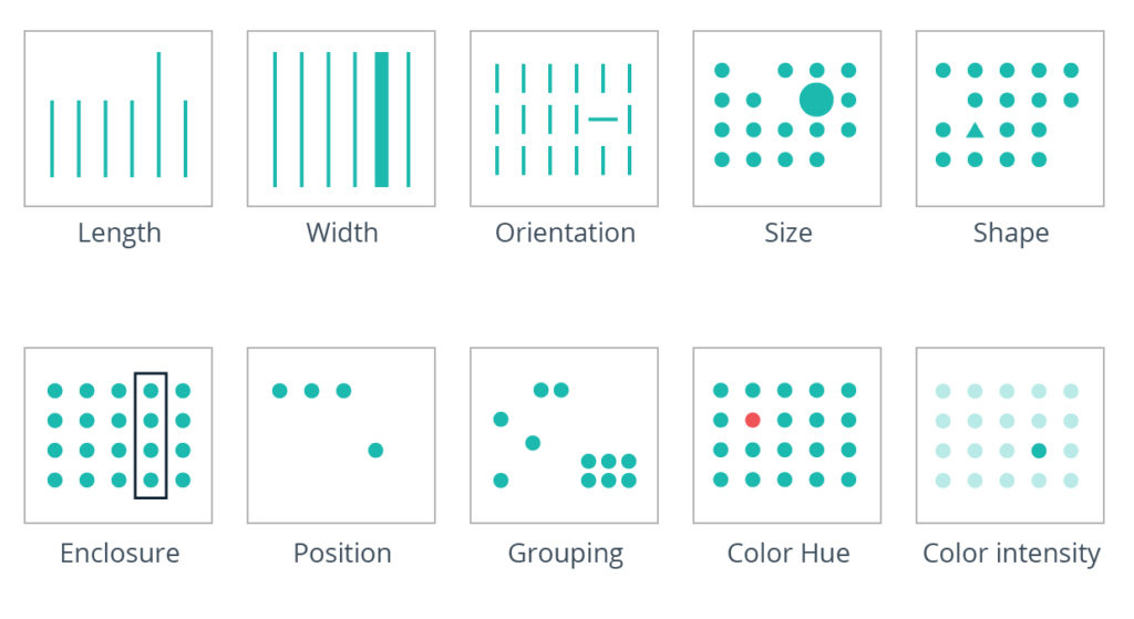
Let’s look at four of these attributes and how they can be leveraged as design building blocks to get the most out of your visual storytelling. Ready to dig into Grouping, Size, Position and Color? Read on!
Grouping
This is when underlying data is aggregated into individual data points, such as hourly vs. daily vs. weekly.
In data storytelling, it’s important to define the differences that are of interest to your audience. Reducing those differences to the minimal granularity needed will allow you to focus the design on the differences you actually care about and eliminate those you don’t.
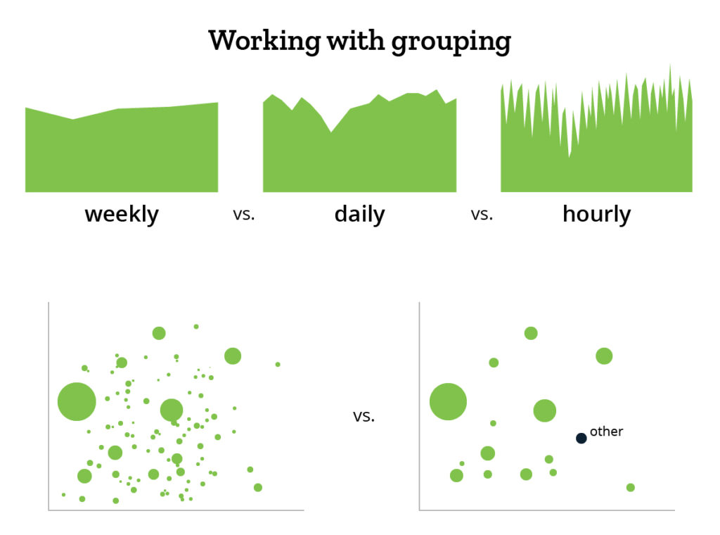
If you’re looking for patterns in utilization for a specific timeframe, say over seven days, you might not be interested in seeing dips over the weekend, which could be a normal business pattern. In this case, a weekly grouping will give you the insights you need without requiring a more granular, daily grouping.
Size
Should a data point be super-sized?
Simply put, how much visual mass does a given data point get? How many pixels? How much ink? Size as a visualization design element excels at representing quantities of measurement: people, dollars, orders, clicks and more. If you’re comparing metrics that are not quantitative, a different design element may be more helpful in distinguishing and comparing values.
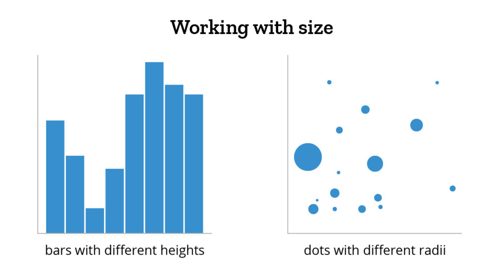
When working with size, it’s critical to maintain true proportions. If you change the y-axis of a bar chart to start at 100 instead of 0, you will interfere with the proportion of the bars. Essentially, a bar taking up twice as much space would no longer represent twice as much stuff. When using circles, you can’t just double the width to represent double the value, since it would actually quadruple the area of the circle. Instead, ensure the relative sizes of the data points preserve the true proportions of the values they represent so the user can accurately compare them.
Position
Where does data go?
Once you know which data to show and how small/big it should be represented, the next step is deciding where those data points should go. Positioning can be used in many ways. In a bar chart, bars can be placed in chronological order to represent time. In a scatterplot, the placement of a data point along the x- and y-axes can be useful in relating points to each other. The distance between data points is important: if two data points are near each other, we know they are similar in some way.
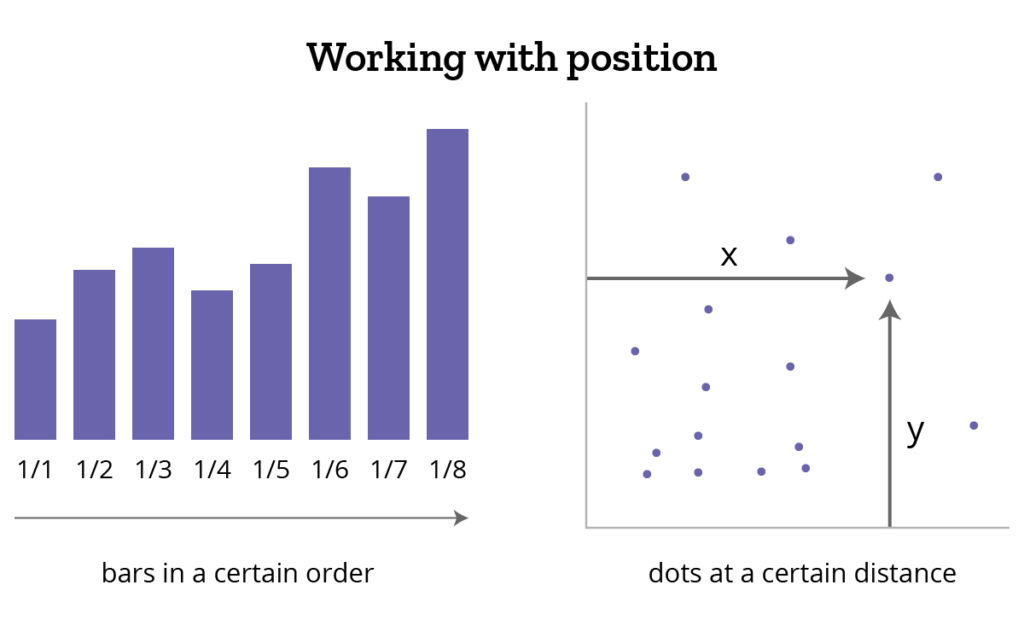
When creating a dashboard of various data charts/widgets/information, position is very important. Most users equate importance to the position on the dashboard with the top left corner being interpreted as most important. Thus, position isn’t just important within an individual data visualization but also encompasses the placement of a chart within a dashboard of information.
Color
Color emphasizes your point.
In many cases, the most obvious pre-attentive attribute in data visualizations is the use of color. Color may be used in one of three primary ways:
- Sequential
- Diverging
- Categorical
Sequential color is the use of a single color from light to dark. Population density may be effectively contrasted in this manner with more dense zip codes being darker than less populous areas. In the graph below, you can see comparative differences in unemployment rates.
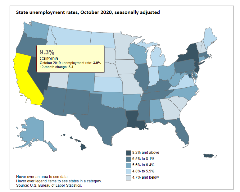
Source: https://www.bls.gov/charts/state-employment-and-unemployment/state-unemployment-rates-map.htm
Diverging color is used to show a range diverging from a midpoint, similar to sequential, but can be used to encode two different ranges such as positive and negative.
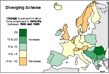
Source: https://web.natur.cuni.cz/~langhamr/lectures/vtfg1/mapinfo_2/barvy/colors.html
Categorical color uses different color hues to distinguish between different categories. Here’s an example that shows the most frequent service requests in NYC.
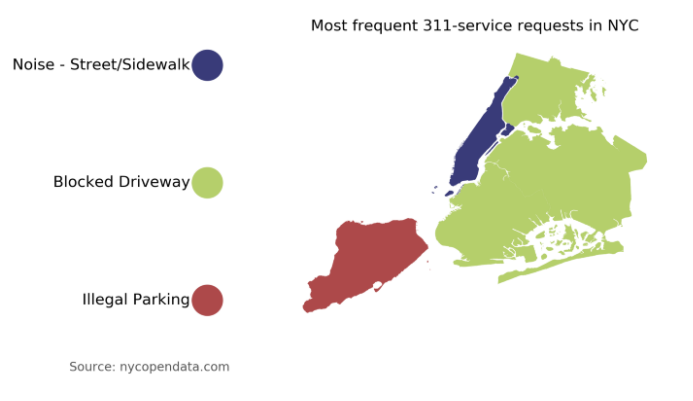
Source: https://towardsdatascience.com/create-categorical-choropleth-with-python-122da5ae6764
While color differences can be obvious to the user, there are a couple of things to keep in mind. Using color to represent gradation comes at the expense of interpreting specific values. Color is helpful and can be used as a grouping mechanism but is less effective in analyzing individual data points. Further, the user can’t perceive measurable differences in color patterns. When you see a darker shade of red above, it doesn’t come with the thought of “oh that’s about 20% darker.” Finally, as designers, we must always be cognizant of potential color blindness and ensure that data visualizations are universally readable.
Data visualization continues to be critically important in the world of analytics, especially in healthcare as data storytelling becomes more widespread throughout the industry. Following these best practices, while keeping important design elements in mind, will help ensure your story is heard, seen effectively and accurately, and most importantly understood.
So, happy visualizing! Let’s look at data in a whole new way!
Get our take on industry trends
Three ways to improve patient retention in recovery programs
Deaths from drug overdoses have increased from ~1 per 100,000 in 1999 to ~4 per 100,000 in 2020.1 The introduction…
Read on...ACOs and value-based care in 2024: Four key questions and answers
ACOs have long been at the front lines of value-based care efforts. In a recent LinkedIn Fireside Chat, Andy Dé…
Read on...How is telehealth impacting STARs performance?
STAR scores are a critical component of success for Medicare Advantage Plans, MSSP and REACH ACOs, driving them to maximize…
Read on...Brief introduction to contract administration
At the top of the year, Rahul Sharma, Chief Executive Officer, and Lynn Carroll, Chief Operating Officer and Cofounder of…
Read on...


